17.12.10

Tonight I'm going to be...


Iconic photograph project. I became Rita Hayworth, an American movie star and dancer and also sex symbol in the 1940s. The photo was shot by Charlie Patterson.

Had to buy one of these

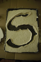
Chocolate typography, also found in the KK Outlet in Hoxton Square. Having sold out of upper case A, my favourite letter, I bought a letter S. Yum.

This Way

Found in the KK Outlet in Hoxton Square in Shoreditch.

Letterpress: The Cockney Alphabet

Final day at the New North Press before the Reverting to Type exhibition at Standpoint Gallery. I spent the first day setting the press with the curator, Graham Bignell, and my Chelsea College tutor, Nigel Bents. It's amazing how long the whole poster takes to set. Measuring and adjusting each letter as thin as a hair space is very time consuming. However, I learnt so much about printing and type so I loved the experience.


Measuring a boarder to fit. Only one poster was printed with a boarder for the exhibition so hopefully I can return in the New Year to help print the remaining 99 sheets.


Inking up. First with a wide roller all over the leads. Then we went over the main letters with a much smaller roller to ensure they printed boldly. This was how day two was spent with Jasper, a fellow graphics student. We printed something between 60-80 posters that day. He had to do all the pressing, my little arms couldn't take the pressure.


Dismantling. Looks like a battle ground. So many tiny pieces to put back in a draw. Locating the draw in the first place took quite a while.


The final poster at Standpoint Gallery.

Papyrus Destroyed

Having waited a week, my plaster papyrus letter finally arrived in Newcastle. It turned out in just the condition I had hoped, nicely smashed up.

7.12.10

Thames-ing it up


Despite the cold, I braved it out with my camera along London's Southbank. I've been trying to work out how my camera works to take good night photography. These came out quite well. With the Christmas market on and all the colourful lights, London is starting to feel quite festive. Still too early if you ask me though.


Plaster Papyrus

Last Thursday I made a lower case 's' in Papyrus typeface out of plaster. This is for the destroy a letter project so I posted it to my home address in Newcastle. I hoped the type would travel up and down the country and return nicely smashed through my letterbox. I sent it on Friday morning however it seems it has not arrived at my parents' house yet. I'll put the results up if/when I get them but here's how I made the cast in the meantime.


30.11.10

Oh Hello...


Alternative Press Fair last Sunday in Euston. I went in the hope of finding some Mark Pawson books as I found out about the event through his website but, sadly, there were none. However the entire place was filled with tables full of artists books, zines and comics. Ended up purchasing a couple of books, one of which is 'Oh Hello..." by Lucy Porter. Nice drawings, rather sinister:


27.11.10

A way to arrange things.

Still working on the Shrine project with Ben, we put all my keyrings in colour order. If there's any way to arrange stuff, by colour is definitely my favourite. We'll continue looking at this and also how to display my collections, possibly in some kind of structure built in the workshop. Work in progress.

26.11.10

Bought

Purchased on ebay this week. They are really very small, only 1x1cm each. I am also having a stamp delivered of Jesus carrying a cross which I won at auction for £1.48. Currently, I'm crazy for stamps and printing. I am even beginning to type all my lists using my typewriter, rather than scribbled straight into my notebook. For example, yesterday's list:


23.11.10

Oxford


I took a trip to Oxford today with my Shrine Project partner, Ben. With an aim to research arrangement of objects and collections, we visited the Pitt Rivers Museum and Natural History Museum. This should help us find a way of arranging my collections in a way that suits his clean and tidy way of life.


The Pitt Rivers museum turned out to be the most useful regarding the project. It was founded in 1883 by General Pitt Rivers who collected a few things himself but acquired most of the objects from auction houses or from other collectors, mainly travelers. The items are grouped by type or function and Rivers tried to put them in order of technical complexity in some cases. How the objects are labeled and stored in cabinets could be helpful when thinking of how to display my collection. All in all, a very worthwhile and enjoyable trip.

Practicing with eatable type

Following the previous post about building letters, we must all create a piece of type (same character and typeface as other project) to be destroyed. I tried making my 's' out of salt crystals which would then be destroyed by being dissolved, however, this has not worked out.


Instead, I am going to try feeding my typography to a rabbit. This time made out of apple. I began experimenting last night (see photo above), however the apple was a bit soft. So, today I purchased much firmer apples. Tesco Crunchy Granny Smiths to be precise. Tomorrow I'm going to Marylebone to borrow by friend's flatmate's rabbit so hopefully the results will be successful.

I also tried cutting papyrus out of some stale ciabatta I had. Not quite such a good result.

Bad type in the workshop

As part of a Bad Type project at Chelsea, each student was assigned a letter to make in the workshop. We continued using the bad typefaces used in a previous project. This left me with lower case 's' in Papyrus. It was great fun in the workshop sawing and sanding the mdf into shape, despite all the nooks and crannies of my letter. Each letter will be painted white and the class will have a 'family day out' around London photographing where we go. More posts to follow.


22.11.10

Just because I love Nan Goldin

That is all.

Back in 2002...

I went home to Newcastle a couple days ago and was looking through my magazine collection and came across these. This is the sort of thing I was reading aged 10. Clearly typography was not an issue back then when choosing a magazine. Nor am I a huge fan of colour now and every page in these is saturated with the brightest colours on the spectrum. Half these magazines are filled with flow charts, for example, 'What is your pyjama style?' as seen below. The rest is 'Cringe' stories and posters of noughties pop stars like Blue, Gareth Gates, Sclub 7, Steps....you can imagine the rest. Or maybe don't.